Friday 4 December 2015

Week Beginning 30th November

The review presentation took place on Monday. I prepared a digital presentation with key images of my development since the last review session, I also presented all the visual research I had produced. 

Things for me to consider going forward include:
  • Instead of bringing all of the visual research and presenting it like a 'bring and buy', I should select key work that supports what I'm saying.
  • As a development I could consider what I can do with 140cm (furnishing width) of fabric before the print repeats, creating large, abstract feature designs.
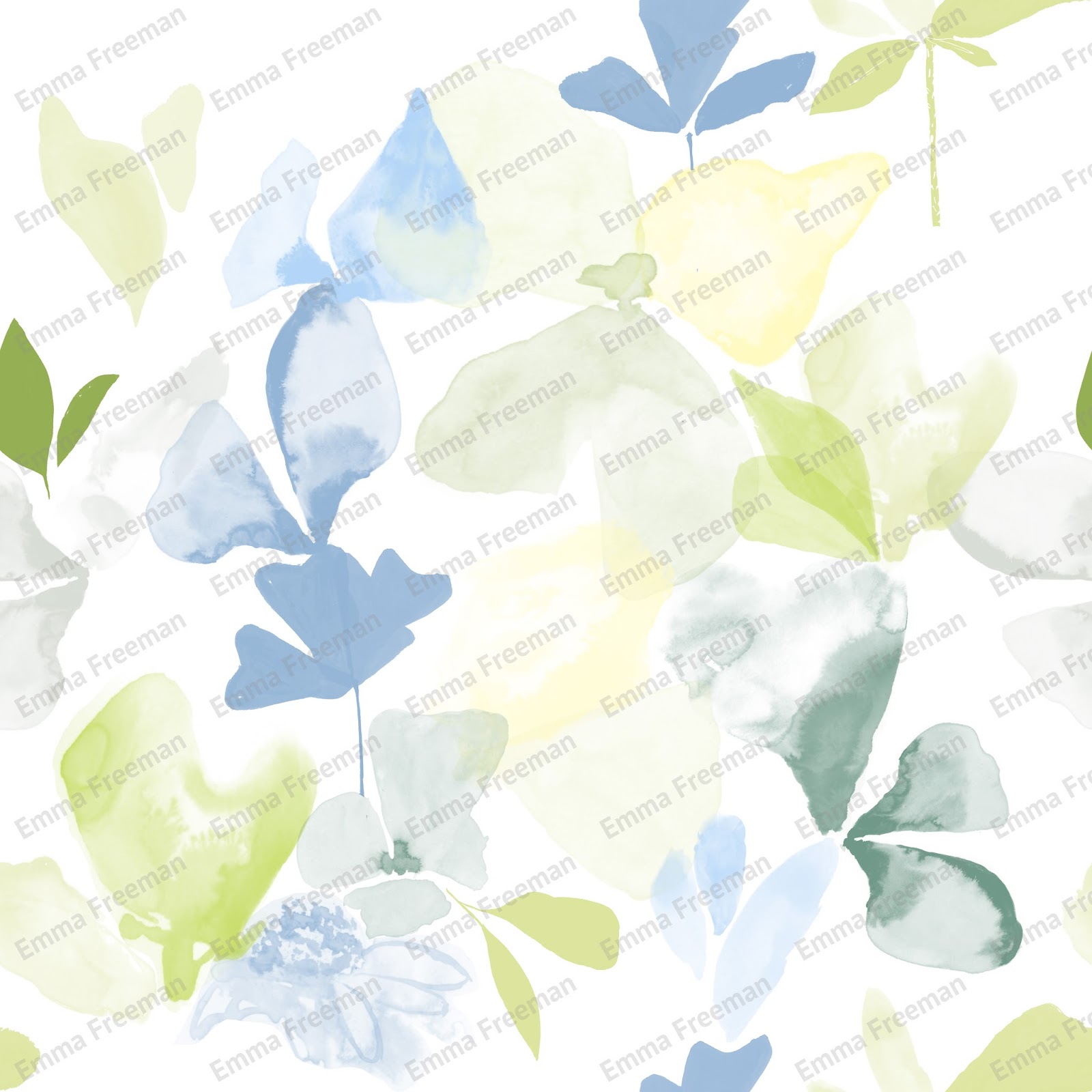
  • I have edited the spot design (below) as it was commented on that by only using two motifs I've lost the difference that makes the other designs effective.


Design Before
Design After


Last week I created some fabric samples using sublimation printing but the fabric wasn't the right weight to portray a cushion fabric. I had them digitally printed onto Cotton canvas, which has the right weight for what I'm looking for . 

Fabric Samples

My next priority is to complete a live brief before the end of the unit. I plan to begin to develop my self initiated project but I also want to focus enough time on a live brief.

Friday 27 November 2015

Week Beginning 23rd November

Below is the line up for my self initiated collection. I believe I have created a collection of prints that has the right amount of experimentation and variation. There was a sixth design (seen in the bottom line up) but on review I felt it wasn't as strong as the others designs especially when put into context, it really stood out.


Design Collection

Including the 6th design


I've designed this collection of prints for interiors, particularly for wallpaper and cushions. This combination of products is one that a lot of leading designers such as Rebecca Atwood and Timorous Beasties produce. The visualisations below show the 'inky' design in context, I especially like the wallpaper visualisation because it looks realistic.


Having 4 weeks to complete each project has been challenging but it has also pushed me to develop my ideas and almost reach a resolve at every 4 week stage.

Friday 20 November 2015

Week Beginning 16th November

This week I have made the decision to move away from expanding the collection of prints from the first four weeks and instead create a separate collection of prints. I made this decision because I could see potential in the visual research to be more than supporting designs for my previous designs. I also see it as an opportunity to broaden my portfolio.


Initially as I was still designing with the idea to create coordinating designs, I was using the same colour palette as my prints for the Bradford Textiles Society competition entry, but when I started to produce design ideas I didn't feel that the colours were having the same impact as the original drawings.


Design I created
Original drawing


The green and blue are too similar tonally, the green floral shapes look drowned out by the blue background whereas in the original drawing the black and white contrast really well and are very striking together. With this in mind I have decided to rethink my colour mood and use a two colour, colour palette of white and indigo blue.


Colour Palette


Wednesday 18 November 2015

Rebecca Atwood

Rebecca Atwood has a simple yet sophisticated design style, it's the type of style I hope to achieve with my self initated collection. Using a two colour, colour palette could be limiting if it's not used in the right way but because Rebecca Atwood's designs are so varied in terms of motifs, scale and composition, it works perfectly.

This amount of variation has been fed into my design work, when experimenting with putting designs together I have considered the use of motifs, scale and composition. The designs (below) are all quite linear based but because they are created using different compositions and scales they look unique to one another.


Saturday 14 November 2015

Week Beginning 9th November

This week I have established what I need to do next. As there isn't a live brief that I like the look of yet I'm going to focus my time on the self initiated project. With the idea to create semi plain prints that complement the collection I produced in the first 4 week project, I have been producing visual research that is created using the same process, creating painterly marks but moving away from focusing on florals and looking instead at abstract shapes.


Visual research I've been producing

To get a clearer idea of how a company puts a print collection together I have conducted research into leading brands such as Harlequin and Romo. The image (below) from Harlequin's website shows their Amazilia collection working in context. There are the stand out, main designs i.e the blue and gold wallpaper but then there are also the simpler prints i.e the hummingbird curtains that are complementing the wallpaper. As a whole all of the prints are working well together. Designers have coordinating designs to compliment the bolder main ones because they know if a customer is decorating a room they will be looking to match their wallpaper with their curtains and their furniture and so they will receive more custom.


Friday 6 November 2015

Week Beginning 2nd November

In the week since the two tutor crit I have been using the feedback I received to make improvements to my work.

Firstly I redesigned the arm chairs for my visualisations as they weren't reflecting the contemporary style of the prints. Comparing the two styles I can now understand what Teresa meant when she said that the chair I chose wasn't contemporary enough. In comparison to the chair after, the original chair looks 'old ladyish' and it's nowhere near as visually exciting as the new visualisation. 

Scaling up the design has added to the appeal as the motifs are so large, it creates a lovely abstract pattern. It's also difficult to identify the repeat, which as a designer you want. Instead of just going with the first piece of furniture I find when creating a visualisation, I've learnt to experiment with a number of different styles because choosing the wrong piece of furniture can ruin the appeal of the print.

The chair before and after the two crit

I have also printed some more A3 samples that are a snapshot of the larger scale and reflect the updated visualisations. I've realised I should take my time when making my samples and visualisations. It's important to have accurate/to scale samples that reflect my visualisations. I plan to print A1/2 paper samples for my portfolio before the end of the unit.

To scale A3 Samples

Saturday 31 October 2015

Week Beginning 26th October

The two tutor crit took place this week and I received a number of helpful feedback comments. Over the coming week I'm going to use this feedback to make the necessary changes to my work and ensure my Bradford project is resolved as well as it can be at this point.
  • As I was struggling with pixelated motifs, I was advised to scan visual research at a larger percentage than 100%. This will enlarge the size of the brushes in photoshop and mean that when the print is scaled up the design won't become pixelated. 
  • The shape of the chair in my visualisations doesn't reflect the contemporary style of the prints.
  • The scale at which I've placed certain prints into the visualisations isn't the most effective so I should experiment with the print's placement.
As this four week project has been in response to the Bradford Textiles Society competition, I have produced a mock up of my submission, doing this has really helped me to come to a resolve for this part of the unit.


Mock up of my Bradford Textiles competition entry

Only having 4 weeks to complete this project, I was initially concerned that I wouldn't get enough done. Surprisingly I feel that I have developed my work at a good pace, making the most of the time I've had. I don't feel that I have explored the potential of this concept and I plan to continue with it in the next 4 weeks. I plan to build my collection, creating coordinating designs that would co-ordinate in a room alongside my upholstery prints.

Friday 23 October 2015

Week Beginning 19th October

This week I have been finalising my work in preparation for the two tutor crit. I have used sublimation printing to produce physical samples, as it is a quicker process than having them digitally printed. With only being able to use synthetic fabrics, I sourced a heavy weight material to portray furnishing fabric.

Fabric Samples

I plan to put the far right design (below) forward for the Bradford Textiles Society competition as I feel this is my strongest design in terms of colour and composition, the repeat is full of life and perfectly represents an abstract flower garden.


Print Collection

I have used a number of the same motifs in the different prints so if a company was to buy one of my designs I wouldn't be able to sell the others that contained the same motifs due to copyright. I consider this a lesson to produce enough visual research that I don't need to duplicate motifs.

I have generated visualisations (below) to see how my designs work in context. When it came to scaling the designs up and printing them out, particularly the top chair, I found that the motifs became pixelated. This is definitely something I need to resolve as you can see from the visualisations that I will need to scale up the designs for them to be realistic.


Visualisations
Until the two tutor crit I will be generating mood boards,samples and preparing for the presentation. I want to make the most of this opportunity as it will be good to hear feedback from 2 tutors as well as my fellow students.

Friday 16 October 2015

Week Beginning 12th October

This week I've finalised my colour palette and below you can see the development from the initial one to the one I am now using. The colour mood of the design now (below, right image) has the right level of richness and tone, it's lively and the colours used emphasise the flower garden theme.

Colour palette development


I have been considering the context of my work, looking at designers that are working at the market level I would. The context for my collection is the high end of the high street,  I can see my products being sold in department stores such as John Lewis but also independents as well. More specifically, the context for my work is similar to that of Timorous Beasties and Bluebellgray. They both create and design contemporary, quirky furnishing fabrics that sells on their own sites and through other design based companies. I feel that my work fits this market because of the style of design, colour use and quality of final product.


I've researched Prestigious Textiles to see what the brand behind the brief is like. They have a diverse mix of contemporary and traditional collections produced in a range of colour palettes including vibrant lively ones, so I definitely think my designs are appropriate.


Context mood board

Friday 9 October 2015

Week Beginning 5th October

This week I have started to think about designs. I have chosen the Prestigious Textiles Print category of the Bradford Textiles Society competition brief and I am designing a repeat for upholstery fabric.

In printing out my early stage designs I've realised I prefer the painterly design (below, right image) to the figurative one(below, left image) as it's so lively in comparison. With this in mind I'm now going to produce prints that focus on the painterly, abstract side of my visual research but still incorporating the solid shapes too.  This week I've been producing more visual research, drawing shapes that can be easily transferred into photoshop rather than a composed piece that's layered up and difficult to extract motifs from.

Initial Designs


Printing out my designs regularly is vital because they can look completely different away from the computer screen. From printing out my designs I've realised I don't like the colour palette I've been using. Instead of picking a colour palette from the internet, that has no relevance to my work, I've now created a colour palette using the primary images I took at the RHS Flower Show. There are so many lovely colour compositions and it ties in really well with the floral theme of the project. I've also visited WGSN looking for on trend colours to feature.

My new colour palette


Wednesday 30 September 2015

Week Beginning 28th September

Following my first 1-1 tutorial of the unit, I have started to produce visual research that is more experimental in terms of media and processes in comparison to the work I produced over the summer. Those drawings are quite figurative and the majority of them were created using pens meaning there isn't a lot of texture or life to them.

Summer work
Examples of the work I've been doing this week

There is a distinct difference between my summer work and the work I am now producing. Initially I was hesitant about the direction in which my work was going as I thought the figurative work was a lot stronger. But on reviewing the two styles I can see there is a lot more potential in the work I am now producing as it is more original in terms of style. The freeness and uncertainty of what could be produced next is exciting.

In this next week I plan to continue experimenting with my processes, creating visual research using different medias. Jenny Garrido's inky paintings (seen below) have inspired my process direction. Her abstract style works so well at creating botanical shapes that look like they are dancing across the canvas. I hope to be able to achieve the same freeness and life when creating my design motifs.


Sunday 2 August 2015

Graduate Show - Adele Fitzgerald


The degree show was a really interesting insight into where we will be in a years times. I was not only inspired by the work of the textile students but also the work of other discipline students as well.


As I am planning to base my third year work on florals, I was particularly looking out for work with the same theme. Seeing Adele Fitzgerald's work I was intrigued and I particularly liked the fact the wallpaper had been embroidered into, I thought that was very original. Her final collection was inspired by the MMU's Special Collections and she has used new techniques to bring life to the neglected designs. I'd used an archive to inspire my work in a previous project and as It was such a useful tool, I've viewed some pieces of textiles from the Downing Collections to see whether there was anything I could take inspiration from. Adele has updated the traditional designs well with the help of her colour palette, that to me still reflects the traditional style but with a contemporary edge. As well as the theme of florals, the context of deigning for wallpaper, is a similarity to my own plans.


I liked the simplicity of Adele's display, having the three designs stand alone allowed them to speak for themselves, the beauty and vibrance of them catches your eye straight away and then as you get closer you realise how much detail has gone into each piece. 


Saturday 1 August 2015

Graduate Show - Esmé Alice Mackey

Piece called Balloon People

Esmé Alice Mackey is an illustration student, who's playful design style drew me in straight away. This year I want to try and develop an illustrative style, and seeing the work of different illustrators is helping me to identify how I want to work. In a similar way to Esme I want to use drawing, painting and other hand techniques to create my prints. Looking at Esme's sketchbook I could tell it was bursting with potential prints and I would like to build my ability to see some inspiration and just draw and draw and draw.


As well as Esme's work, I saw the work of another illustration student called Elsa Frere, who's work had a similar style to Esme's work. The scale of Elsa's work, filling an a1 sheet with an illustration is something I want to explore when producing my prints, pushing myself to really scale up my work and try a more hands on approach when creating.


Elsa Frere's Degree Show Stand