In printing out my early stage designs I've realised I prefer the painterly design (below, right image) to the figurative one(below, left image) as it's so lively in comparison. With this in mind I'm now going to produce prints that focus on the painterly, abstract side of my visual research but still incorporating the solid shapes too. This week I've been producing more visual research, drawing shapes that can be easily transferred into photoshop rather than a composed piece that's layered up and difficult to extract motifs from.
Initial Designs

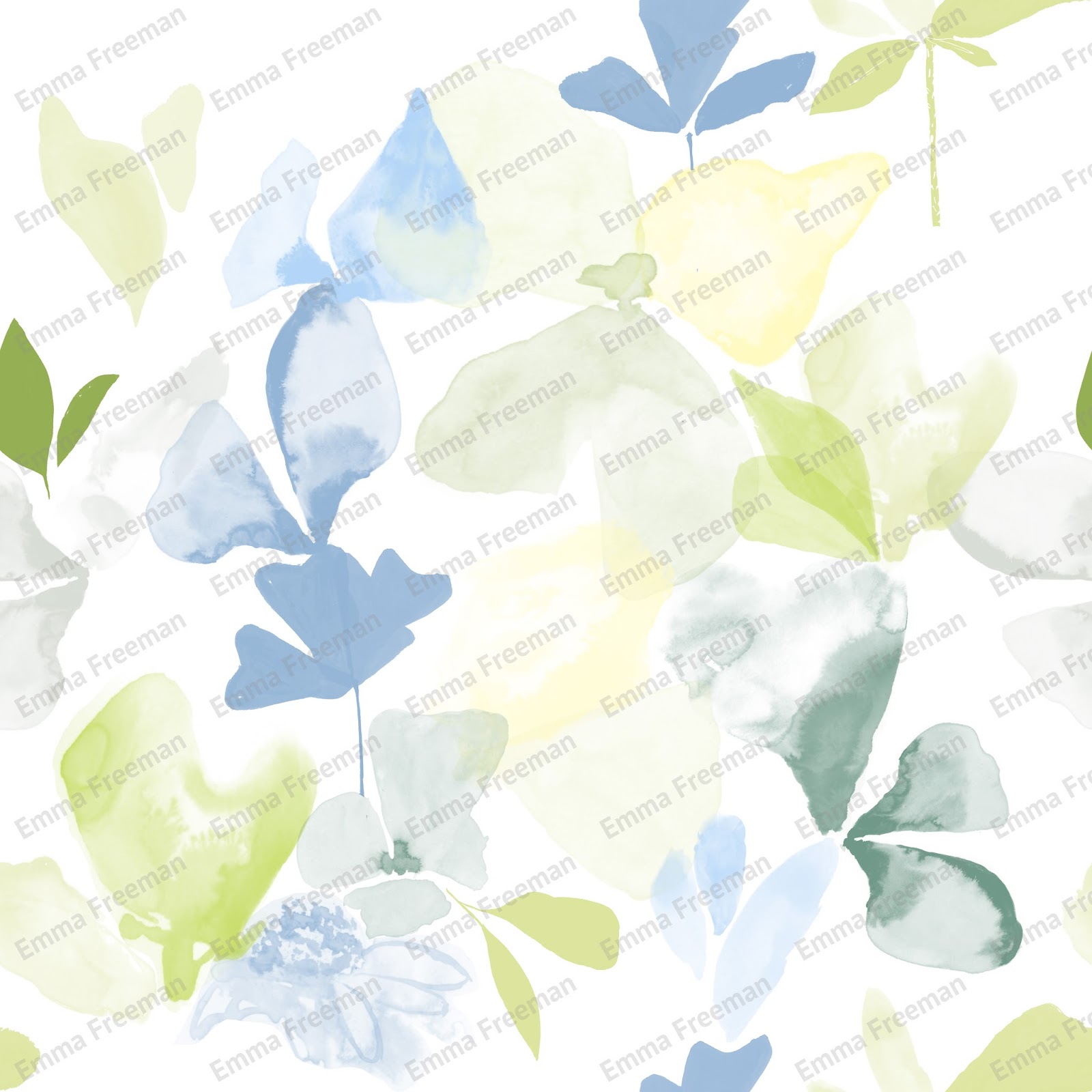
Printing out my designs regularly is vital because they can look completely different away from the computer screen. From printing out my designs I've realised I don't like the colour palette I've been using. Instead of picking a colour palette from the internet, that has no relevance to my work, I've now created a colour palette using the primary images I took at the RHS Flower Show. There are so many lovely colour compositions and it ties in really well with the floral theme of the project. I've also visited WGSN looking for on trend colours to feature.
My new colour palette


No comments:
Post a Comment