Thursday, 4 February 2016

Week Beginning 1st February

As this is the final week of the unit, my time has been focused on preparing for assessment. It's been really interesting to see how much work I've  generated over the unit and how my ideas have developed. I'm glad I've been quite organised throughout, it's meant I've not had to catch up on too much work at this late stage. 

In terms of my self initiated project I have begun to develop ideas for the scaling up aspect I've discussed in my learning agreement.  This has been something I've really wanted to explore but having only a week or two left after completing the live brief and wanting to start preparing for assessment, this development has taken a back seat. Saying that I have generated 2 feature designs that are 140cm width and experimented with visualising them on cushions in different placements. In the mood board below you can see how I have developed the idea, the cushions are a really exciting starting point. This is an interesting development that I plan to continue with into unit x.
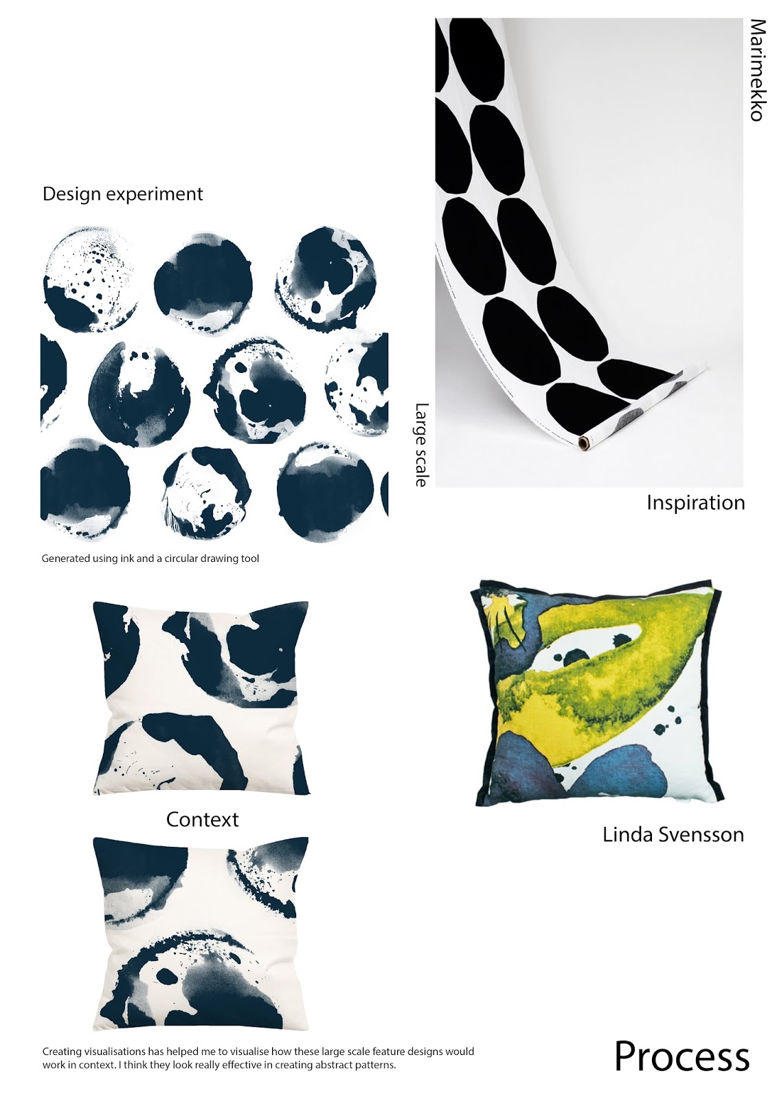

Process Moodboard

I have also been working on complimentary designs for the collection I produced in the first 4 weeks as this was something I originally planned to do. I've generated a number of designs, in different colour ways, that I believe compliment but also contrast with my 4 upholstery designs. Until this unit I'd never really thought about complimentary design and now when I look at a designers collection, i'll look out for the main designs and those that are coordinating with them.


Friday, 29 January 2016

Week Beginning 25th January

This week I've finalised my designs (below) for the Adamley live brief. I have printed them to scale, on paper (40cmx40cm) as they are designs for pocket squares.


Print Collection
As a collection I think the designs compliment one another, there is enough variation in terms of motifs and compositions but at the same time they still look like they belong together. I have varied the compositions, incorporating the boarder into some of the designs but then also having a block boarder and even no boarder, this is an improvement from my initial designs that had no regard for the boarders.

Initially to create visualisations I had considered having samples printed and photographing them in context but with the time constraints I felt creating a visualisation on the computer would be easier. I tried using an image I found on the internet but I felt it looked really unrealistic.


Edited photo visualisation

I then created a digital visualisation, the difference between this visualisation and the one above is remarkable. Although this is a drawing it looks a lot more professional than the earlier attempt, it also looks more realistic. This kind of realisation that something isn't right is key especially as I am now producing work for my graduate portfolio. I want my portfolio to represent the best of my work so producing professional visualisations is important.


Digital visualisation

Thursday, 21 January 2016

Week Beginning 18th January

Following this weeks tutorial, Ive had a lot to think about in terms of my Adamley pocket square designs. Rather than using an image I found on the internet as my colour reference, I've been advised to find a colour palette that is on trend, looking particularly at menswear trends. I have looked for either mustard or orange to be in the palette as these are strong and popular colours for menswear accessories. I found two images that really caught my eye whilst on WGSN looking at the menswear SS17 colour trends, the orange is vibrant and contrasts well with the blue tones.


Colour Palette

As this is my first experience with designing for accessories, I'm learning new things all the time. In terms of composition I've started to reconsider the boarders of my designs, as the majority of them are a block of solid colour and quite harsh in comparison to the central patterned area. With this in mind I've been placing different pieces of my visual research together and photographing them to give me some ideas for patterned boarders. 

Generating compositions

In the image below you can see how I have taken the right composition above and developed the design (below, left) in terms of colour and composition, altering the layout and incorporating motifs into the boarder to create the design (below, right). In comparison to the earlier design there is more variation and when the pocket square is folded, in use, it could look really interesting as there are a number of different motifs at work next to one another. I will continue to experiment with different layouts, using the whole canvas and not just the central area.


Thursday, 14 January 2016

Week Beginning 11th January

I've chosen to spend the next few weeks focusing on producing an outcome for the Adamley live brief to produce a print for men's silk accessories. I have chosen to generate designs for pocket squares. In terms of a starting point I didn't see anything that particularly inspired me in the Adamley archives, so I've decided to use less obvious references in the form of photographs of interesting compositions, shapes and textures, that I took whilst on the mill visit.


Using the same abstract, painterly drawing technique I have been using throughout this unit, I've created a number of potential design motifs. To develop it on from my previous drawing work I have brought in the contrast of linear qualities, looking at the finer details. I'm doing this so that the work in my portfolio doesn't all end up looking too similar.


Visual research


To get a good idea of the types of designs Joanne from Adamley might be interested in I've conducted research into the high end independents they have supplied to for example Doherty Evans and Stott and Turnball and Asser. The key thing to remember from the briefing is definitely colour, when wearing formal/workwear men will often use a pocket square or neck tie to show off their personality. I'm going to try to include orange or mustard as it was mentioned in the briefing that they were strong colours.

Doherty Evans and Stott


Friday, 4 December 2015

Week Beginning 30th November

The review presentation took place on Monday. I prepared a digital presentation with key images of my development since the last review session, I also presented all the visual research I had produced. 

Things for me to consider going forward include:
  • Instead of bringing all of the visual research and presenting it like a 'bring and buy', I should select key work that supports what I'm saying.
  • As a development I could consider what I can do with 140cm (furnishing width) of fabric before the print repeats, creating large, abstract feature designs.
  • I have edited the spot design (below) as it was commented on that by only using two motifs I've lost the difference that makes the other designs effective.


Design Before
Design After


Last week I created some fabric samples using sublimation printing but the fabric wasn't the right weight to portray a cushion fabric. I had them digitally printed onto Cotton canvas, which has the right weight for what I'm looking for . 

Fabric Samples

My next priority is to complete a live brief before the end of the unit. I plan to begin to develop my self initiated project but I also want to focus enough time on a live brief.

Friday, 27 November 2015

Week Beginning 23rd November

Below is the line up for my self initiated collection. I believe I have created a collection of prints that has the right amount of experimentation and variation. There was a sixth design (seen in the bottom line up) but on review I felt it wasn't as strong as the others designs especially when put into context, it really stood out.


Design Collection

Including the 6th design


I've designed this collection of prints for interiors, particularly for wallpaper and cushions. This combination of products is one that a lot of leading designers such as Rebecca Atwood and Timorous Beasties produce. The visualisations below show the 'inky' design in context, I especially like the wallpaper visualisation because it looks realistic.


Having 4 weeks to complete each project has been challenging but it has also pushed me to develop my ideas and almost reach a resolve at every 4 week stage.

Friday, 20 November 2015

Week Beginning 16th November

This week I have made the decision to move away from expanding the collection of prints from the first four weeks and instead create a separate collection of prints. I made this decision because I could see potential in the visual research to be more than supporting designs for my previous designs. I also see it as an opportunity to broaden my portfolio.


Initially as I was still designing with the idea to create coordinating designs, I was using the same colour palette as my prints for the Bradford Textiles Society competition entry, but when I started to produce design ideas I didn't feel that the colours were having the same impact as the original drawings.


Design I created
Original drawing


The green and blue are too similar tonally, the green floral shapes look drowned out by the blue background whereas in the original drawing the black and white contrast really well and are very striking together. With this in mind I have decided to rethink my colour mood and use a two colour, colour palette of white and indigo blue.


Colour Palette