Being the last project of my degree I wanted to ensure that I used my time effectively to create prints that showcase my potential as a digital print designer. I've wanted to push my practice particularly in terms of scale, colour and composition. I've used a large scale canvas and oversized motifs to generate large, abstract feature designs. As well as feature designs I've created co-ordinating designs that compliment the main designs. I believe generating a number of varied collections showcases my ability to consider how an interior collection of designs work on their own or as part of a interior space.
Initially I had only planned to use one colour mood but after realising that it would push my practice and benefit my portfolio I decided to use three different colour palettes. Thinking back I now realise that if I had only used one colour palette my designs could have ended up looking too similar to one another.
In terms of being ready for life after graduation and finding employment, I have created promotional material including a website, an instagram and business cards. I want to be prepared for potential employers, buyers or suppliers who may be looking to view my work. I think it's particularly important to have promotional material with going to new designers because you never know who you might meet whilst there. I do however believe I could have been more proactive in contacting freelance designers and asking for their advice on entering the working world but this is something that I can do once I graduate, it may even lead to work experience.
I think that the degree show and new designers will be two great opportunities to showcase my work, I'm interested to find out what the viewing public think of my work. I'm so pleased to have been chosen to exhibit at new designers, it will be a great experience and hopefully I will make some connections, whether it be other designers or potential employers.
Throughout this year I have developed a characteristic style that has helped me to find my strengths as a print designer. I'm pleased with my design portfolio for this unit, I think that I have generated a number of designs, visualisations and artworks that are worthy to be in my graduate portfolio.
Friday, 20 May 2016
Friday, 13 May 2016
Portfolio
I have chosen to create a physical portfolio and a website to represent my work. As I am designing for an interior context I've created an A1 portfolio of artworks, visualisations and to scale designs as well as designs showing their repeat. Putting the physical portfolio together has been a great experience because I have been able to review my work and see the journey of my project.
I have also created a website with an online portfolio, I think a website is key in the digital society that we live in today. Companies can easily access your work and you can regularly update your website to keep people interested.
The link to my website ... www.efreeman-design.com

The link to my website ... www.efreeman-design.com

Friday, 29 April 2016
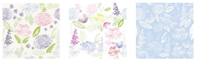
Context
I've aimed to produce a diverse collection of feature
designs for interior that appeal to those buyers who are looking for a print
that could stand-alone in a room. I have also created complimentary designs
to co-ordinate with the feature designs because I've learnt the importance of creating a varied collection.
By conducting market research at different levels, I have found that there is a demand for this style of painterly florals. BHS, Zara, John Lewis and Matalan are a few of the high street stores that feature this trend.
I have developed my designs for a range of home wares because I wanted to create collections that could be easily translated into different rooms and products.


I wanted to push myself to try and contextualise my designs in new ways, once I started to visualise my designs on tableware I researched into how I could create physical samples.
Friday, 15 April 2016
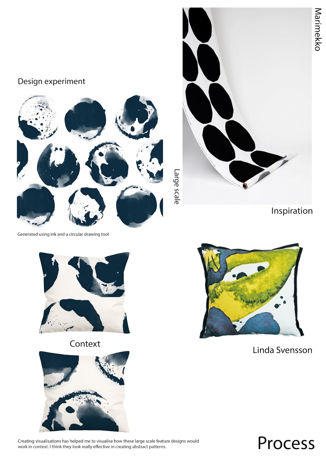
Development
A huge focus of my project has been on scale, I wanted to produce large scale prints that when put into context look abstract and oversized. For example I think that the two cushions (seen below) are really effective in creating an abstract aesthetic. I like how one print design can create a number of different placement ideas.


Another stage of development was selecting the right colour palettes. Initially I hadn't planned to use more than one colour palette but after realising that it would broaden my portfolio and push my practice I decided to create 3 different collections each with a colour mood.
It took some trial and error to find the right colour moods as I wanted colours that were sophisticated and told a story from one another.

Above shows the colour development of one of my designs, Initially I liked the motifs but felt that the composition and colour wasn't working, I then developed the design and the colour but still didn't like the way the colour was spread so I decided to try this design in the two tone colour palette and invert the colours. I believe that this design is now fresh and lively.
Friday, 11 March 2016
Research
I have built on the research I acquired in the Practice unit, both contextual and visual research.
Whilst conducting market research I've noticed that a lot of high street homeware stores have adapted the painterly floral trend in Spring Summer. This is both a positive and a negative, a positive because there is clearly a demand for this kind of product, a negative because it means that I will need to make sure my work is original in comparison.


Although I am using the same concept of painterly florals I wanted my visual research to be different to that I created in the Practice. Instead of creating ariel view paintings I have been creating still life compositions that could be sold as artworks in their own right. I tried to create paintings in the colours of my palette but I find it so much easier to paint in black and white as I can completely concentrate on the painting rather than mixing colours. It is however something I want to be able to do in the future.
 |
| Example of Practice visual research |
 |
| Example of Unit X visual research |
Friday, 26 February 2016
Project Introduction
During this unit I want to expand my practice to produce a number of digitally printed collections that explore scale, composition and colour.
I particularly want to explore scale as this was something I started experimenting with in the Practice unit. I'm going to look at using the full width of a furnishing fabric (140cm), whether it’s scaling up my motifs or creating large abstract feature designs.
Creating a number of collections with different colour moods will be a challenge for me as I am used to creating one collection with one colour palette, but pushing myself to do different colour moods will broaden my design portfolio.
Sunday, 7 February 2016
Practice Unit Evaluation
I feel I have continued to challenge myself throughout this unit. To begin with I was quite hesitant to move away from the linear drawing style I had adopted and challenge myself with the unfamiliarity's of abstract mark making but I'm so glad I did as it has really pushed and developed my practice. I'm proud of the work I have produced and feel that it is reflected in how I have applied myself throughout this unit.
Initially I was concerned about the quick turn around of each project, having 4 weeks for each, doesn't seem long at all, but I've been so surprised by the amount of work I have produced and how it has developed from my initial ideas. I'm pleased that I have managed my time quite well, generating outcomes for three projects. I do however wish I had made some more time for the development of my self initiated project since Christmas but I do feel I have started something quite interesting and have shown the potential of an idea I plan to develop into unit x.
Having the Bradford textiles Society Competiton brief and the Adamley live brief to complete gave me a chance to engineer prints for different audiences as well as my own self initiated brief. Being able to Complete different briefs is a huge part of being a designer in the industry, especially a freelance designer, so having such short turn arounds has been an eye opener for what the industry might be like.
I feel that I have improved my understanding of the print for interiors industry, getting to grips with printing to scale samples and also complimentary designs.
If I was to compare where I am now to where I was this time last year or even at the end of last year, I would say my practice has developed hugely. I take the time to consider what I am doing a lot more, especially now as I am producing work that will be in my graduate portfolio. I feel that I have developed a characteristic style that is unique and exciting, I'm looking forward to unit x as it will be a further opportunity to develop my skills and understanding.
Thursday, 4 February 2016
Week Beginning 1st February
As this is the final week of the unit, my time has been focused on preparing for assessment. It's been really interesting to see how much work I've generated over the unit and how my ideas have developed. I'm glad I've been quite organised throughout, it's meant I've not had to catch up on too much work at this late stage.
In terms of my self initiated project I have begun to develop ideas for the scaling up aspect I've discussed in my learning agreement. This has been something I've really wanted to explore but having only a week or two left after completing the live brief and wanting to start preparing for assessment, this development has taken a back seat. Saying that I have generated 2 feature designs that are 140cm width and experimented with visualising them on cushions in different placements. In the mood board below you can see how I have developed the idea, the cushions are a really exciting starting point. This is an interesting development that I plan to continue with into unit x.
I have also been working on complimentary designs for the collection I produced in the first 4 weeks as this was something I originally planned to do. I've generated a number of designs, in different colour ways, that I believe compliment but also contrast with my 4 upholstery designs. Until this unit I'd never really thought about complimentary design and now when I look at a designers collection, i'll look out for the main designs and those that are coordinating with them.


In terms of my self initiated project I have begun to develop ideas for the scaling up aspect I've discussed in my learning agreement. This has been something I've really wanted to explore but having only a week or two left after completing the live brief and wanting to start preparing for assessment, this development has taken a back seat. Saying that I have generated 2 feature designs that are 140cm width and experimented with visualising them on cushions in different placements. In the mood board below you can see how I have developed the idea, the cushions are a really exciting starting point. This is an interesting development that I plan to continue with into unit x.
 |
| Process Moodboard |
I have also been working on complimentary designs for the collection I produced in the first 4 weeks as this was something I originally planned to do. I've generated a number of designs, in different colour ways, that I believe compliment but also contrast with my 4 upholstery designs. Until this unit I'd never really thought about complimentary design and now when I look at a designers collection, i'll look out for the main designs and those that are coordinating with them.


Friday, 29 January 2016
Week Beginning 25th January
This week I've finalised my designs (below) for the Adamley live brief. I have printed them to scale, on paper (40cmx40cm) as they are designs for pocket squares.
As a collection I think the designs compliment one another, there is enough variation in terms of motifs and compositions but at the same time they still look like they belong together. I have varied the compositions, incorporating the boarder into some of the designs but then also having a block boarder and even no boarder, this is an improvement from my initial designs that had no regard for the boarders.
Initially to create visualisations I had considered having samples printed and photographing them in context but with the time constraints I felt creating a visualisation on the computer would be easier. I tried using an image I found on the internet but I felt it looked really unrealistic.
I then created a digital visualisation, the difference between this visualisation and the one above is remarkable. Although this is a drawing it looks a lot more professional than the earlier attempt, it also looks more realistic. This kind of realisation that something isn't right is key especially as I am now producing work for my graduate portfolio. I want my portfolio to represent the best of my work so producing professional visualisations is important.
 |
| Print Collection |
Initially to create visualisations I had considered having samples printed and photographing them in context but with the time constraints I felt creating a visualisation on the computer would be easier. I tried using an image I found on the internet but I felt it looked really unrealistic.
 |
| Edited photo visualisation |
I then created a digital visualisation, the difference between this visualisation and the one above is remarkable. Although this is a drawing it looks a lot more professional than the earlier attempt, it also looks more realistic. This kind of realisation that something isn't right is key especially as I am now producing work for my graduate portfolio. I want my portfolio to represent the best of my work so producing professional visualisations is important.
 |
| Digital visualisation |
Thursday, 21 January 2016
Week Beginning 18th January
Following this weeks tutorial, Ive had a lot to think about in terms of my Adamley pocket square designs. Rather than using an image I found on the internet as my colour reference, I've been advised to find a colour palette that is on trend, looking particularly at menswear trends. I have looked for either mustard or orange to be in the palette as these are strong and popular colours for menswear accessories. I found two images that really caught my eye whilst on WGSN looking at the menswear SS17 colour trends, the orange is vibrant and contrasts well with the blue tones.
As this is my first experience with designing for accessories, I'm learning new things all the time. In terms of composition I've started to reconsider the boarders of my designs, as the majority of them are a block of solid colour and quite harsh in comparison to the central patterned area. With this in mind I've been placing different pieces of my visual research together and photographing them to give me some ideas for patterned boarders.
In the image below you can see how I have taken the right composition above and developed the design (below, left) in terms of colour and composition, altering the layout and incorporating motifs into the boarder to create the design (below, right). In comparison to the earlier design there is more variation and when the pocket square is folded, in use, it could look really interesting as there are a number of different motifs at work next to one another. I will continue to experiment with different layouts, using the whole canvas and not just the central area.

 |
| Colour Palette |
As this is my first experience with designing for accessories, I'm learning new things all the time. In terms of composition I've started to reconsider the boarders of my designs, as the majority of them are a block of solid colour and quite harsh in comparison to the central patterned area. With this in mind I've been placing different pieces of my visual research together and photographing them to give me some ideas for patterned boarders.
 |
| Generating compositions |
In the image below you can see how I have taken the right composition above and developed the design (below, left) in terms of colour and composition, altering the layout and incorporating motifs into the boarder to create the design (below, right). In comparison to the earlier design there is more variation and when the pocket square is folded, in use, it could look really interesting as there are a number of different motifs at work next to one another. I will continue to experiment with different layouts, using the whole canvas and not just the central area.

Thursday, 14 January 2016
Week Beginning 11th January
I've chosen to spend the next few weeks focusing on producing an outcome for the Adamley live brief to produce a print for men's silk accessories. I have chosen to generate designs for pocket squares. In terms of a starting point I didn't see anything that particularly inspired me in the Adamley archives, so I've decided to use less obvious references in the form of photographs of interesting compositions, shapes and textures, that I took whilst on the mill visit.


Using the same abstract, painterly drawing technique I have been using throughout this unit, I've created a number of potential design motifs. To develop it on from my previous drawing work I have brought in the contrast of linear qualities, looking at the finer details. I'm doing this so that the work in my portfolio doesn't all end up looking too similar.
 |
| Visual research |
To get a good idea of the types of designs Joanne from Adamley might be interested in I've conducted research into the high end independents they have supplied to for example Doherty Evans and Stott and Turnball and Asser. The key thing to remember from the briefing is definitely colour, when wearing formal/workwear men will often use a pocket square or neck tie to show off their personality. I'm going to try to include orange or mustard as it was mentioned in the briefing that they were strong colours.
 |
| Doherty Evans and Stott |
Subscribe to:
Comments (Atom)