Saturday 31 October 2015

Week Beginning 26th October

The two tutor crit took place this week and I received a number of helpful feedback comments. Over the coming week I'm going to use this feedback to make the necessary changes to my work and ensure my Bradford project is resolved as well as it can be at this point.
  • As I was struggling with pixelated motifs, I was advised to scan visual research at a larger percentage than 100%. This will enlarge the size of the brushes in photoshop and mean that when the print is scaled up the design won't become pixelated. 
  • The shape of the chair in my visualisations doesn't reflect the contemporary style of the prints.
  • The scale at which I've placed certain prints into the visualisations isn't the most effective so I should experiment with the print's placement.
As this four week project has been in response to the Bradford Textiles Society competition, I have produced a mock up of my submission, doing this has really helped me to come to a resolve for this part of the unit.


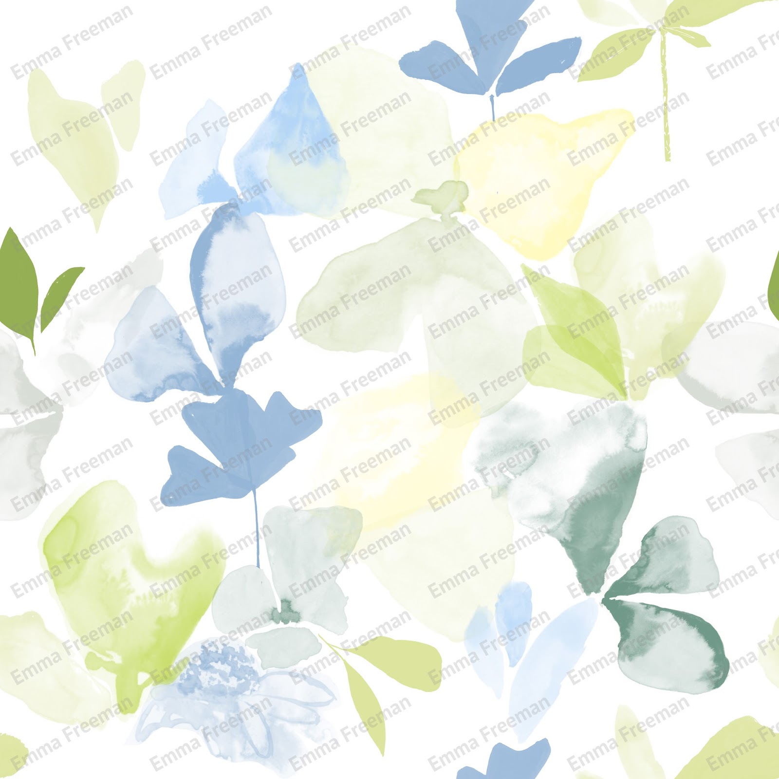
Mock up of my Bradford Textiles competition entry

Only having 4 weeks to complete this project, I was initially concerned that I wouldn't get enough done. Surprisingly I feel that I have developed my work at a good pace, making the most of the time I've had. I don't feel that I have explored the potential of this concept and I plan to continue with it in the next 4 weeks. I plan to build my collection, creating coordinating designs that would co-ordinate in a room alongside my upholstery prints.

Friday 23 October 2015

Week Beginning 19th October

This week I have been finalising my work in preparation for the two tutor crit. I have used sublimation printing to produce physical samples, as it is a quicker process than having them digitally printed. With only being able to use synthetic fabrics, I sourced a heavy weight material to portray furnishing fabric.

Fabric Samples

I plan to put the far right design (below) forward for the Bradford Textiles Society competition as I feel this is my strongest design in terms of colour and composition, the repeat is full of life and perfectly represents an abstract flower garden.


Print Collection

I have used a number of the same motifs in the different prints so if a company was to buy one of my designs I wouldn't be able to sell the others that contained the same motifs due to copyright. I consider this a lesson to produce enough visual research that I don't need to duplicate motifs.

I have generated visualisations (below) to see how my designs work in context. When it came to scaling the designs up and printing them out, particularly the top chair, I found that the motifs became pixelated. This is definitely something I need to resolve as you can see from the visualisations that I will need to scale up the designs for them to be realistic.


Visualisations
Until the two tutor crit I will be generating mood boards,samples and preparing for the presentation. I want to make the most of this opportunity as it will be good to hear feedback from 2 tutors as well as my fellow students.

Friday 16 October 2015

Week Beginning 12th October

This week I've finalised my colour palette and below you can see the development from the initial one to the one I am now using. The colour mood of the design now (below, right image) has the right level of richness and tone, it's lively and the colours used emphasise the flower garden theme.

Colour palette development


I have been considering the context of my work, looking at designers that are working at the market level I would. The context for my collection is the high end of the high street,  I can see my products being sold in department stores such as John Lewis but also independents as well. More specifically, the context for my work is similar to that of Timorous Beasties and Bluebellgray. They both create and design contemporary, quirky furnishing fabrics that sells on their own sites and through other design based companies. I feel that my work fits this market because of the style of design, colour use and quality of final product.


I've researched Prestigious Textiles to see what the brand behind the brief is like. They have a diverse mix of contemporary and traditional collections produced in a range of colour palettes including vibrant lively ones, so I definitely think my designs are appropriate.


Context mood board

Friday 9 October 2015

Week Beginning 5th October

This week I have started to think about designs. I have chosen the Prestigious Textiles Print category of the Bradford Textiles Society competition brief and I am designing a repeat for upholstery fabric.

In printing out my early stage designs I've realised I prefer the painterly design (below, right image) to the figurative one(below, left image) as it's so lively in comparison. With this in mind I'm now going to produce prints that focus on the painterly, abstract side of my visual research but still incorporating the solid shapes too.  This week I've been producing more visual research, drawing shapes that can be easily transferred into photoshop rather than a composed piece that's layered up and difficult to extract motifs from.

Initial Designs


Printing out my designs regularly is vital because they can look completely different away from the computer screen. From printing out my designs I've realised I don't like the colour palette I've been using. Instead of picking a colour palette from the internet, that has no relevance to my work, I've now created a colour palette using the primary images I took at the RHS Flower Show. There are so many lovely colour compositions and it ties in really well with the floral theme of the project. I've also visited WGSN looking for on trend colours to feature.

My new colour palette